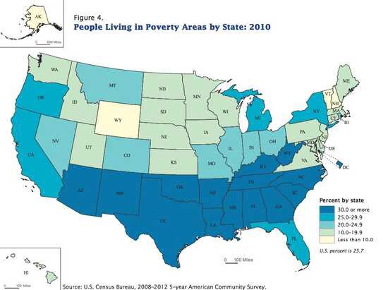
Well, this one is a no brainer, but yet more proof that the Old South, and the red states in general, have a virtual lock on the bottom half of any continuum you want to suggest. This, from the Daily Kos, maps out the poverty rate for the country as a whole. No surprises here:
My only criticism: the states should get redder as they get poorer.

Post a Comment